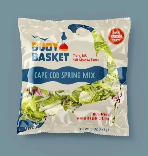
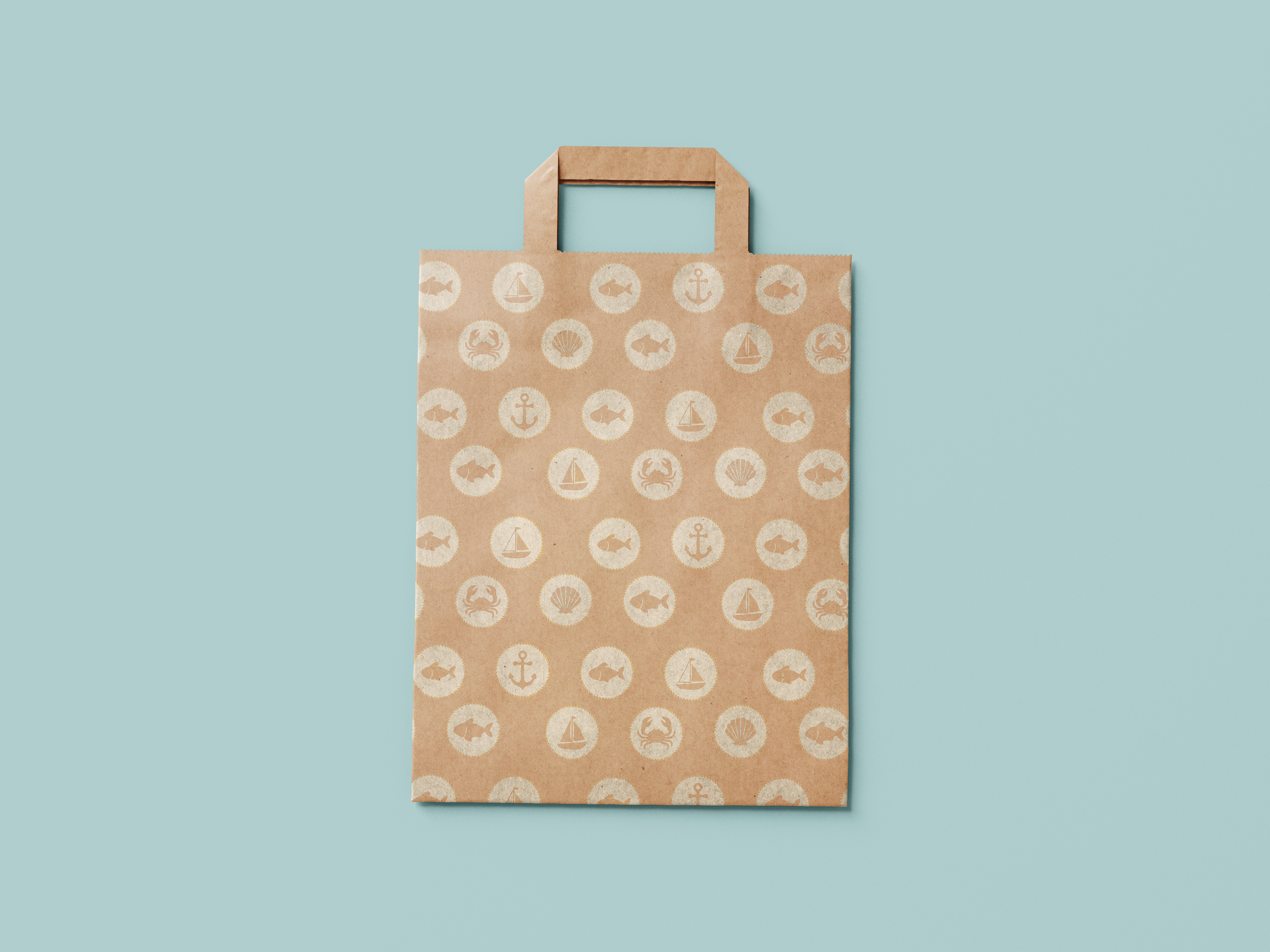
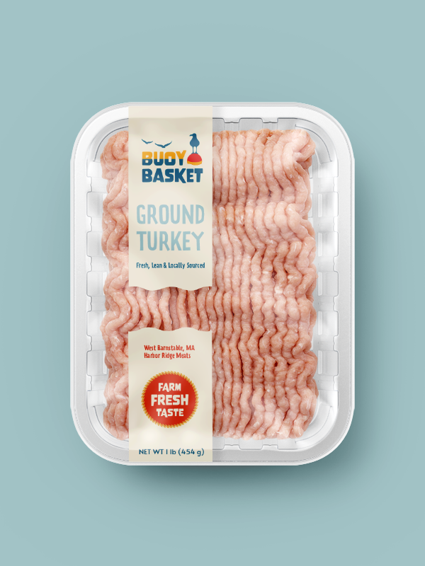
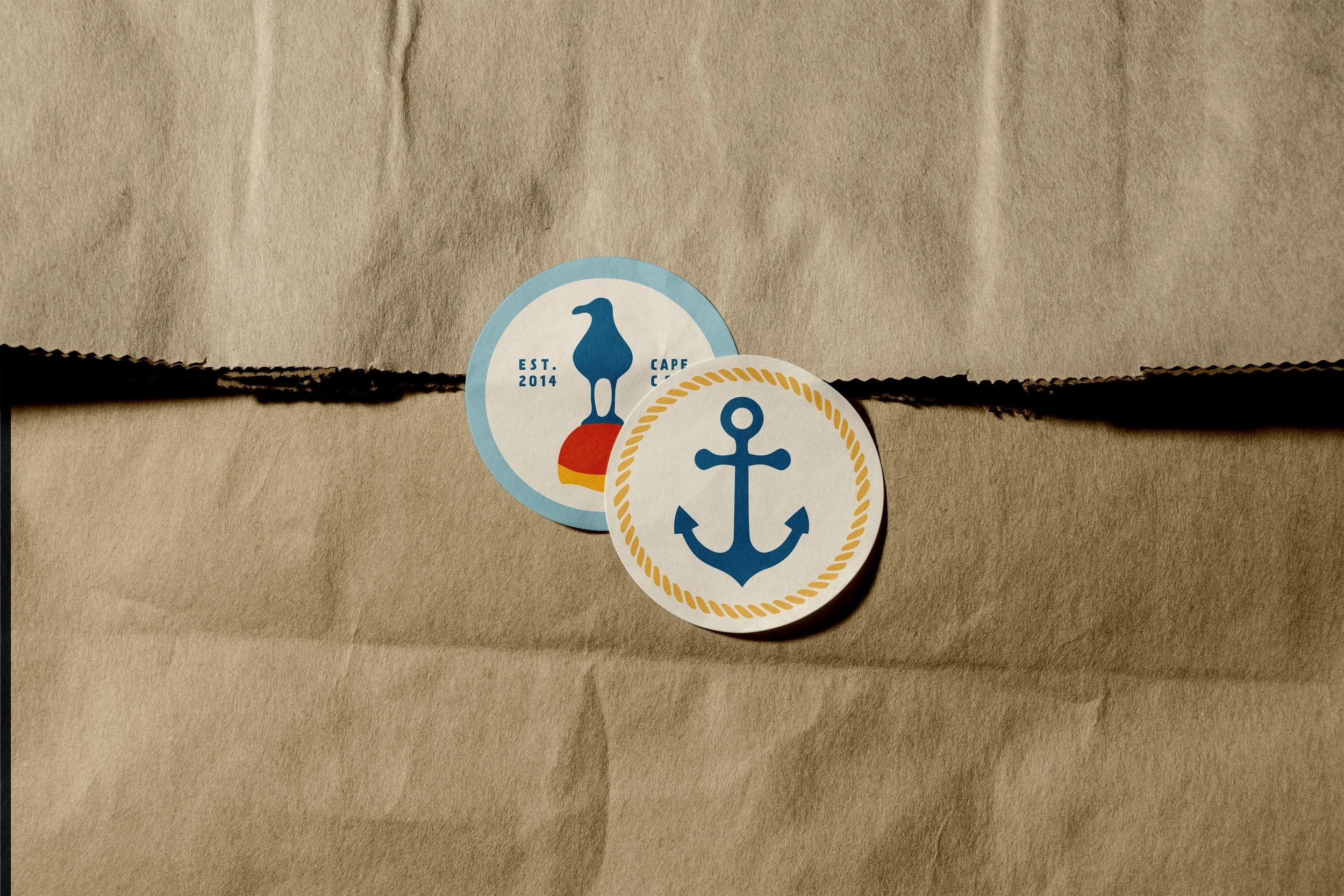
Buoy Basket: The Best Market in Cape Cod
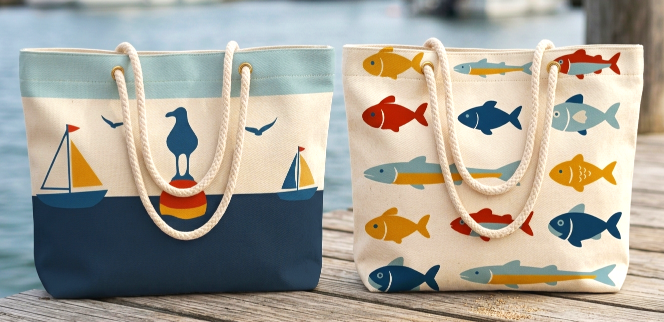
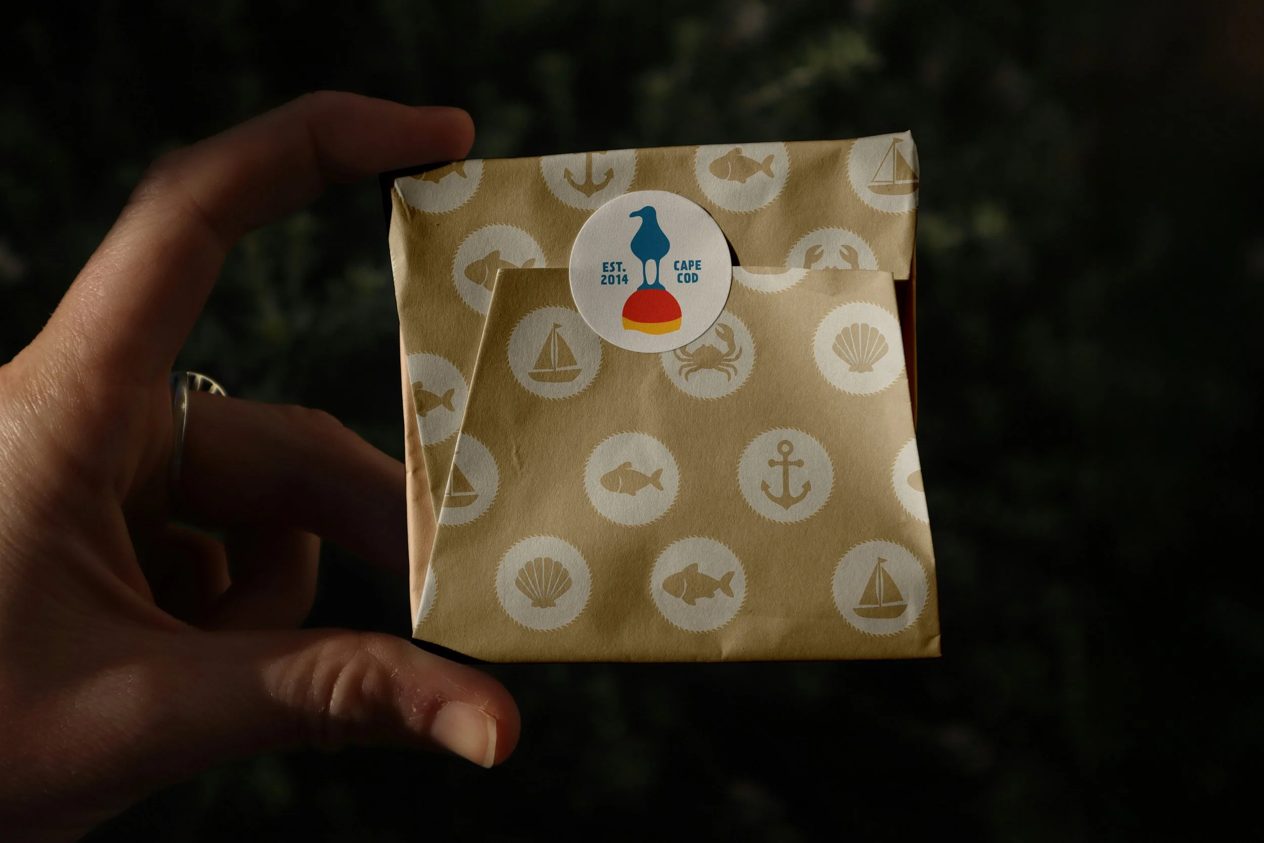
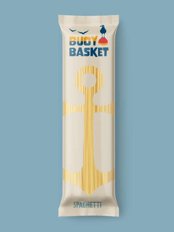
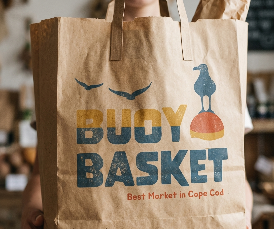
Buoy Basket is a brand identity project for a Cape Cod market built around the idea of “by land and sea,” combining local authenticity with a warm, approachable feel. The logo uses bold, rounded type and simple coastal elements like a seagull and buoy to root it in place, while the split-color lettering reflects the connection between land and water. The palette draws from sand, ocean blues, and sunlit reds to create something that feels fresh and familiar. This system extends across reusable bags, food packaging, and motion graphics, using soft shapes, clean color blocking, and subtle movement inspired by waves and coastal air. The result is a cohesive, modern brand that still feels true to Cape Cod.